Organising events involves a lot of work. Every event professional can confirm this. Formulating objectives, getting all stakeholders on the same page, gathering the contacts for the invitee list, arranging the catering, finding a location … But let’s not forget to create an appealing invitation email and event website. How do you ensure your email stands out, within an average attention span of 8 seconds? And to you create an appealing event website that is functional at the same time? In this interview, Momice designers Michel and Victorine share their tips & tricks.
1. Get inspired
When organising an event, you start with a step-by-step plan. And, according to the designers, getting inspiration should be the first step when designing your event website. Victorine: “Start by writing down associations or creating a word cloud. Write down everything that comes to mind about the event you are organising. It does not have to be specific, especially in the beginning. So take all the obvious terms into account as well!”
“Websites like Design Awards, Behance.net and Freepik are good sources to find inspiration”, says Michel. According to Victorine, sites like Pinterest, Dribbbl and Muzli should not be overlooked. Victorine: “When designing websites, I always start with a conceptual design – it doesn’t need to be functional at this point. Fill this website with colours and images to see what you like and what not.” Some time to spare? Make a template, so you can re-use it for other pages or events. Michel: “Experiment with colours in your template to see what works and what doesn’t. There’s a lot of trial and error involved in the design process.”
Get inspired by the work of our designers. Download our Lookbook!
2. Stand out, but don't shout
Michel and Victorine indicate that most people are visually oriented. To stand out in an overflowing inbox, designing a header that grabs the attention is key. Michel: “Your header must provide a clear image of the event subject. Don’t choose random images: choose an image that matches your key message, use a proper title, combined with a subtitle if needed. And don’t forget to add your logo!”
In addition, be careful not to be too loud. Victorine: “It is better to omit intense animations and opt for a small detail – such as a blinking eye – instead. I love to work with cool images and colours. Colours really stick with people.”
3. Design with a purpose
The aesthetic point of view should never be the only approach to a design, according to the designers. Michel: “You always design with a purpose. Both the website and the invitation have to be appealing and stand out, but your visitors don’t come to your website to look at the images. Improve the user-friendliness by using three colours, where one accent colour can be used as a path to visually guide the visitor somewhere – such as a “Register” call-to-action.”
“Think about every design and make conscious decisions. Keep in mind what you want to tell your audience, and whether the message could be supported by an image. Or, choose to skip the images in order to create more room for textual information.” It is helpful to collect the available information before starting the design. Victorine: “First, create all the pages and fill them with content before you start to design your homepage. It will create more peace on your website”
4. Play around with the corporate style
Many companies and organisations work with a corporate style. Victorine: “Try to follow the rules of this corporate style as much as you can, even if it does not match your personal principles. An event website and invitation are often a bit more informal than the company style. The brandbook of an organisation often contains guidelines – eg. for button colours – but don’t be afraid to experiment with the colours a little. Sometimes, you have to be creative with fonts. You can use the corporate style fonts in headers, but unfortunately you can’t always use your own font in online software. In this case, you can use the colours to bring out the corporate style!”
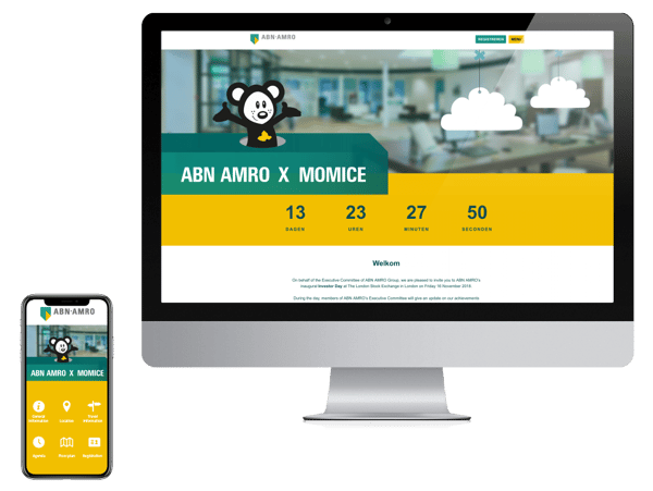
Some brandbooks leave less room for flexibility, but that doesn’t have to be a problem. Michel: “When recognisability of the organisation is very important, there is less room for creativity. However, you can try to create a different look and feel by using patterns that appear in the different design elements. Maybe there is a pattern in the corporate colour combination. For example, ABN AMRO uses a little bit of yellow, combined with green and darker green. These ratios are you could keep in mind when designing your event website and invitation.”
5. Think about the visitor
Victorine: “You can design something you like, based on you personal taste, but that’s always functional. Always keep the end user [the website visitor] in mind and try to put your own preferences aside.”
It is important that the event website has a clear structure. Michel: “A beautiful design really give a wow effect, for example by using a cool image or animation. But if the visitor thinks: ‘What is this about? Where can I find the information I need?’, you know you have done it wrong. A functional design does not need that wow effect, but ensure a clear structure for the end user instead. This could be achieved by placing a clear CTA (call-to-action) or specific reference points that are visible at a glance.”
6. Don't look for perfection
According to Michel, perfection is one of the biggest pitfalls when designing your event website or mailing. “There are so many possibilities, at one point you just have to make a decision. However, there are guidelines for what people usually experience as appealing or pleasant. A full screen - somewhat transparent - background, is nice to look at. Generally, a centered text in the header and clear, legible CTA’s are considered appealing.”
7. Create variation
As designers, Michel and Victorine are creating attractive event websites and mailings every day. Victorine: “Your event website and mailing are not an annual financial report, it may radiate some playfulness. Add an extra twist to your website by playing with the corporate style. Events are fun, so let it show in the design of your website and mailing!”
Michel compares an attractive design with a song. “A bit of variation is always nice, like the bridge in a beautiful song. A constant repetition becomes boring. Create an “aha” moment by using a different colour or alternate text in the images!”
How to set up a good mailing? Download our event mailings white paper
Conclusion
Designing an event website or mailing does not have to be complicated. If you take a step-by-step approach, dare to play around and experiment a lot, you create a design that grabs the attention in no time! And remember: balance is key. A balanced website is appealing to the visitor. “Seduce the visitors by offering small pieces of information at a time. Guide your event website visitor through your story, but don’t reveal the plot!”